I need to create this layout and I'd like to do as much of it as possible with CSS, rather than using images and whatever.
As such, how can I do this in CSS? (if at all?)
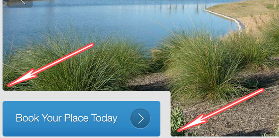
As you can see, there is the image behind, with the button overlaid with padding. The bit that I'm struggling with is creating the curves on the IMAGE above and to the left of the button and bottom to the right of the button (I've pointed them out on the pic below).
Any help would be great.
Thanks
You don't have to split your image at all, only the container divs.
Let me detail a bit: You can have your image set as a background image instead of putting it in a src attribute of an img tag. This technique is most commonly used when working with CSS sprites.
So, if you have you uppermost div at a constant width and height, if you try to apply the background image in it, you'll see it fits very nice.
On the bottom, you have two divs or whatever block element you'll like, just be sure to put fixed width and height, so the background will be applied and you will be able to actually see it.
Then all you have to do is fiddle with css background-position to adjust the SE chunk of image.
I'll be putting a small demo together to better illustrate the idea. After you have a big div at the top, and two smaller at the bottom, where two of them share the same background-image, but with different background-position, you can safely add some css3 border-radius to fit your roundness needs. You can also use some tool like http://css3generator.com/ to add a compatibility layer on all browsers with ease.
I know just enough CSS to be dangerous so I can't detail every step, but I think you can approach it like this:
Split the background image into two separate images both at a z-index of 0 at the height of the top of the grey box. I think you can use two div's that reference the same original image with different offsets (similar to CSS Sprites) but I don't know the details of how to do that. The left edge of the lower div would start where the grey box ends. Round the lower-left corner of each "image" div.
Add the grey box at a z-index of 1 with appropriate rounding, and then the blue box at a z-index of 2, again with appropriate rounding.
The background of the block element containing all of this would also have to be grey to match the grey border and properly fill in grey where your right-most arrow is pointing.
That is very easy to realize with pure css. The page you have shown is divided into 3 divs without any margin. You only need to set the right border radius for each div.
This is a function of the background image, which is a css element if that's what you mean, but it is not a seperate attribute for a selector, at least not in standard CSS. Wait until CSS3 becomes more prevelant, then it's corner-radius or some such thing.
Well it's 3 probably 3 seperate divs, a hole "burned" into the background image, or a div being overlayed for the button.
The best way to figure out how it's done is to read the source of the page you found it on.
For convenience: If you have a webkit based browser like chrome or safari then enable developper mode mouse over the button "right click" and choose inspect element. Otherwise you can pour over the page source until you find what you want.
corner-radius, and I'm good with just using CSS3. However I don't know how to get these corners after overlaying the button (with padding) or however else you would do this - Thomas Clayson 2012-04-03 20:02
If you have a webkit based browser like chrome or safari then enable developper mode mouse over the button "right click" and choose inspect element. Otherwise you can pour over the page source until you find what you want - awiebe 2012-04-03 20:08